| |
|
#1
 13th September 2011, 05:26 PM
| ||||
| ||||
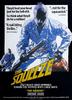
| Well, you've all seen the front artwork for the upcoming Arrowdrome Horror release, The Devil's Kiss which looks like this...  Today, Arrow have revealed what the reverse artwork will look like. So here it is...  What do you think? Are you a fan? Which one do you prefer? The Devil's Kiss will be out in stores and online from the 17th of October bizarre_eye@Cult Labs and skankenstoned like this.
__________________   |
|
#2
13th September 2011, 05:27 PM
| ||||
| ||||
|
Another nice reverse cover.  |
|
#3
13th September 2011, 05:35 PM
| ||||
| ||||
|
I much prefer Arrow's cover. I like the original artwork, but i don't like the way it is coloured. Its as if it was coloured with pencils. |
|
#4
13th September 2011, 05:50 PM
| ||||
| ||||
|
La Perversa! 
__________________  Teddy, I'm a Scotch drinker - you know that. I just have the occasional brandy when I'm not drinking. |
|
#5
17th September 2011, 10:45 AM
| |||
| |||
| Quote:

__________________ When the going gets tough the tough take the law into their own hands. |
|
#6
31st October 2011, 11:09 PM
| ||||
| ||||
|
Why - just like it once already happended with "The House by the Cemetery" does this title have no small version of the cover on the spine. Looks really empty. The image is missing on both covers, not just - like pictures in the first post - on the reverse with the original artwork.
__________________ |
 |
| Like this? Share it using the links below! |
| |


 2Likes
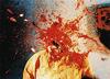

 iluvdvds@Cult Labs


 Hybrid Mode


