| |
|
#1
 1st June 2010, 11:34 PM
| ||||
| ||||
|
Hope its ok to start a new thread on just this since the old thread is closed? I'm really interested in horror artwork! It was interesting to read people's reactions to the cover artwork. I love the design! (And for what it's worth, I'm speaking as a painfully PC feminist  ) )However, I can understand people saying it isn't appropriate to the film. I haven't seen the film (I've been waiting for a DVD for years), but obviously its not really Argento's style. There are a lot of different issues here. For one thing, these Arrow horror DVDs are totally playing on the great horror tradition of exploitation - i.e. a film's marketing emphasising and exaggerating sex and gore. Its mainly basing its designs on 80s video nasties - and they frequently portrayed scenes that didn't even occur. This design is lurid, apparently makes little sense in relation to the film, gratuitously violent, and needlessly sexualised - great! Maybe it is inappropriate for this particular film, but it I guess it would create a marketing problem for Arrow to do this as separate to their current white-box series (and the classic Inferno artwork would be undermined by the white border anyway). They must want to capitalise on the interest and 'brand identity' (ugh) already created by the other DVDs, but maybe it would have been best to do this differently - its hard to imagine 'Suspiria' with anything other than its classic poster as a cover - and again, a retro 80s VHS white border type design would wreck that. I guess Argento is much more arthouse than exploitation, and maybe the artwork should reflect that. KRW said: "I didnt think I'd see covers like that in 2010. It's like Benny Hill directed a horror movie." I totally disagree - Benny Hill was dodgy because of the context in which it consistently portrayed women (though it was probably too ridiculous to seem seriously sexist!). This is just one picture that emphasises a woman's ass. Maybe its a little too... 'emphasised' by the artist, and overall a little too cartoonish - I wouldn't put it on my living room wall - but I do have up a poster for 'Lost in Translation' which is basically just a close-up of Scarlett Johannson's ass - and that is considered an artistic, iconic poster! As Nigel Tufnel said: "What's wrong with being sexy?" Now feel free to mock my ridiculous over-analysing!  |
|
#2
2nd June 2010, 07:26 AM
| ||||
| ||||
|
Thanks for resurrecting the artwork aspect of the closed thread Owls, as it is indeed interesting and definitely worth discussing!  Also - I'm not going to mock at all, as I always enjoy reading other people's opinions. Also - I'm not going to mock at all, as I always enjoy reading other people's opinions.  My take on the new artwork at first was horror. Horror, in the fact that it didn't ring true with the essence of the film for me, but I certainly didn't hate it, and it has definitely grown on me since my first impressions too. There are aspects of it that I don't like (in particular the font title font type: it looks like a seedy motel sign), but I think most people were more outraged by 'the ass', which I can live with. You ask "what's wrong with sexy?" - and I reply "nothing", but there is a very fine line between sexy and sleazy, and this one could be considered border-line sleazy by many. I think the problems people have with the artwork are easily negated by the inclusion of the three alternative panels in this release: if you don't like it, you have other options. Also, it was designed to be an alternative and original artwork concept for the film and ticks all the necessary boxes in a merketing sense: vibrant colours, eye-catching imagery...  , plus it does depict one of the key scenes in the movie, so is not there to paint a false picture; just a slightly fantasised one! All these points are great for catching consumer eyes and snagging sales. Whilst I personally prefer the alternative panels (growing up with skull art and all... ), if any of these, or a variation on them were used as the main cover, I believe they'd easily get lost amongst the other dreck lining the shelves of HMV sadly. , plus it does depict one of the key scenes in the movie, so is not there to paint a false picture; just a slightly fantasised one! All these points are great for catching consumer eyes and snagging sales. Whilst I personally prefer the alternative panels (growing up with skull art and all... ), if any of these, or a variation on them were used as the main cover, I believe they'd easily get lost amongst the other dreck lining the shelves of HMV sadly. So, whilst I would of preferred a more gothic take on artwork with less sleaze and more substance, I've also been thinking about it more, and understand that Rick has created something completely fresh and original for Arrow, which no other release world-wide will possess; and love it or hate it these covers certainly get noticed and that I suppose, is the intention.  |
|
#3
2nd June 2010, 02:52 PM
| ||||
| ||||
|
No problem with this thread being started - I was planning to set it up now that we have the finished exploded packshot image so you can see all the treats including.... not 4, not 6 but 8 postcards - lovely lobbycard reproductions from around the world for Inferno! That's added to a double-sided poster - the flipside being a fab original quad artwork, booklet and four display artwork options (or three if you with to deny one of them exists at all!) 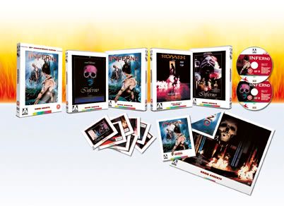 |
|
#4
2nd June 2010, 02:57 PM
| ||||
| ||||
|
Omg that really looks spectacular *faints*
__________________ Is that a gun in your pocket or are you just happy to see me? |
|
#5
2nd June 2010, 04:57 PM
| ||||
| ||||
| Quote:
 I want it now........ I want it now........ |
|
#6
2nd June 2010, 05:16 PM
| ||||
| ||||
|
Glorious.Arrow are producing dangerously high quality packages....only problem is,how do you top packages like these?  Not that I'm complaining.....we're being spoiled once again! 
__________________  Teddy, I'm a Scotch drinker - you know that. I just have the occasional brandy when I'm not drinking. |
|
#7
2nd June 2010, 05:20 PM
| ||||
| ||||
|
Fantastic stuff. |
|
#8
8th June 2010, 12:06 AM
| ||||
| ||||
| Quote:
).As for Rick's artwork, it's a great piece of work in and of itself but I still feel it's a little misrepresentative of the actual film. It's a verrrrrry minor gripe though, as there's 3 other marvellous panels to choose from and the last thing I want is to offend Rick. He's a talented bloke and an asset to Arrow, no doubt about it.
__________________ Sent from my Hoover using the power of Uri Gellar |
|
#9
3rd June 2010, 08:46 AM
| ||||
| ||||
| Quote:
ORDERED! |
|
#10
3rd June 2010, 12:03 PM
| ||||
| ||||
|
Yeah, I've gone ahead and pre-ordered this too.  |
 |
| Like this? Share it using the links below! |
| |


 TheOwlsAreNotWhatTheySeem


 Hybrid Mode


