|
|
#1
 1st September 2012, 09:55 AM
| ||||
| ||||
|
Hello Shameless fans! Here's a little bit of news for you all regarding the Cannibal Holocaust release. The new batch of Cannibal Holocaust DVDs and Blu-rays will now feature the reverse artwork as the front artwork, and the front as the reverse. So from now onwards, you'll start to see the DVD/Blu looking like this in shops:  with the reverse as: 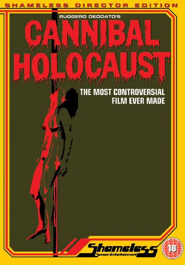 What do you guys think? JoshuaKaitlyn likes this.
__________________   |
|
#2
1st September 2012, 09:55 AM
| ||||
| ||||
|
Personally I think it's definetly the right way to go. More often than not, the original artwork used on the reverse is incredible and can be much better than the front. They're so much more eye-catching and with the yellow borders, really do stand out!
__________________ |
|
#3
1st September 2012, 10:20 AM
| ||||
| ||||
|
Hmmmm tbh, I don't really see the point. People are going to buy it regardless of what artwork they see in the shops.
__________________ "Give me grain or give me death!" |
|
#4
1st September 2012, 10:25 AM
| ||||
| ||||
|
Much better even though i would have like to see the classic Cannibal Holocaust font/logo on the front instead.
__________________ |
|
#5
1st September 2012, 10:28 AM
| ||||
| ||||
| Quote:
 Daemonia likes this.
__________________ |
|
#6
1st September 2012, 10:54 AM
| ||||
| ||||
| Quote:
__________________ "Give me grain or give me death!" |
|
#8
1st September 2012, 01:04 PM
| ||||
| ||||
| Quote:
But just for you. (See doesn't work)  At this rate, maybe Arrow and Shameless should just release plain artwork and have all the title fonts and taglines inside as stickers instead and people can make the cover of their choice.  Hawkmonger and ReturnToZero like this.
__________________ BEYOND HORROR DESIGN |
|
#9
1st September 2012, 01:07 PM
| ||||
| ||||
|
*edit*
__________________ BEYOND HORROR DESIGN |
|
#10
1st September 2012, 01:08 PM
| ||||
| ||||
|
*edit*
__________________ BEYOND HORROR DESIGN |
 |
| Like this? Share it using the links below! |
| |


 8Likes


 Linear Mode


